Peloton has started introducing a small yet handy update for its members who enjoy the power zone classes. As of now, it’s being gradually rolled out to members, and not everyone has access to it yet. However, it seems like it will become available to everyone shortly. We got a hint of this when Matt Wilpers shared news about it on his social media.
Update as of October 2023: Peloton has officially named this update “Peloton Power Zone Compliance,” and it should be accessible to all users.
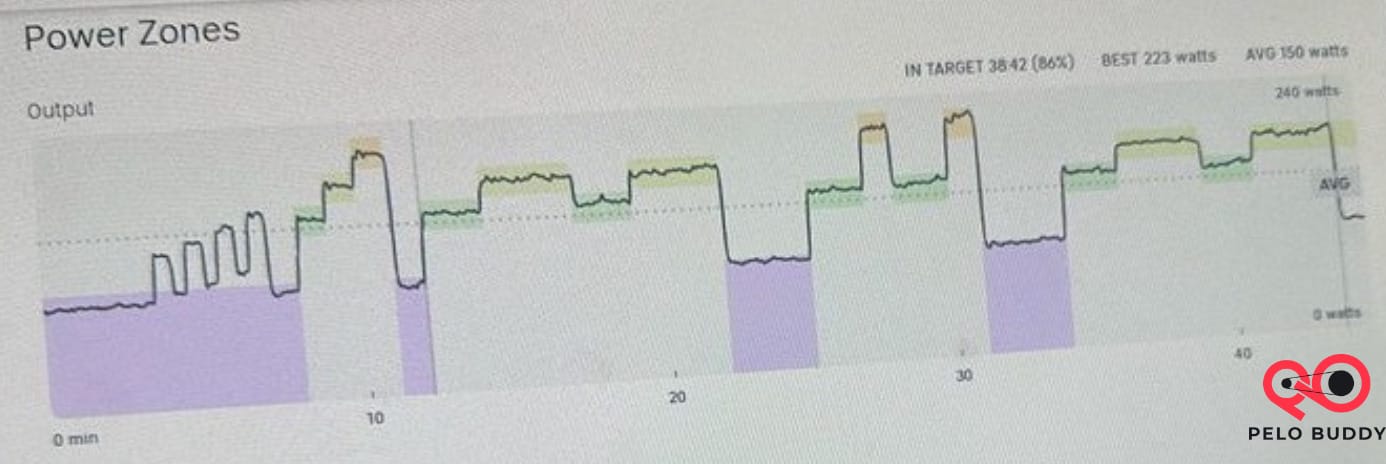
Now, when you check the workout summary page after completing a power zone class on the Peloton Bike or Bike+, you’ll find a new section called “Power Zone.” In this section, there’s a graph that visually represents the time you spent in each zone, a bar graph, and an overall score. This feature is officially known as the Peloton Power Zone Compliance Graph.
Target Power Zone Graph On Peloton
The most significant update is the fresh graph that illustrates how your ride aligns with the instructor’s zones – referred to as the Peloton power zone graph or target power zone graph. Until now, members had to resort to external tools like mPaceLine, PZPack, Power Zone Plus, and others to create their post-workout graphs.
Now, this information is available within the Peloton ecosystem. However, please note that the new post-workout power zone section is currently visible exclusively on the Bike/Bike+ screen itself. You won’t find the same graphs on the Peloton app (either iOS or Android) or the Peloton website.

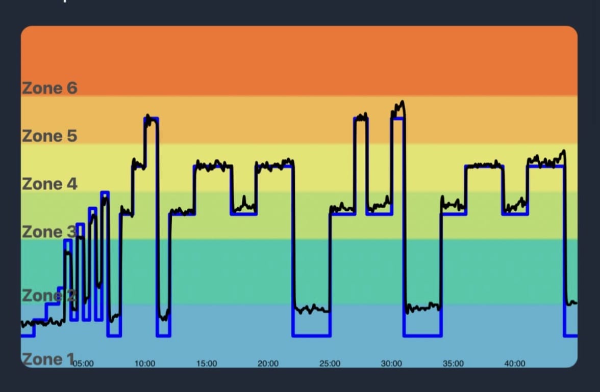
The appearance of the post-workout zone graph in the user interface differs from what members may be accustomed to with third-party tools. However, now that this information is on the screen and visible, Peloton could easily make further adjustments to the graph’s visual style if they wished to do so.

It’s essential to note that Peloton doesn’t appear to include spin-ups when determining the target zones on the graph. As illustrated in the example above, during the warm-up when spin-ups were called, Peloton displays the target zone as a constant Zone 1.
Time In Zones In Power Zone Rides On Peloton
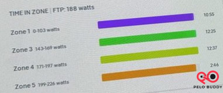
In the new section, the next data point you’ll find is a fresh bar graph labeled “Time In Zone.” This graph displays a section for each zone announced during the ride, with color-coded lines indicating your performance in each zone.

The bar graph serves as a visual gauge, ranging from 0 to 100%, showing how long you spent in each zone. To the right of each line, you’ll also find the precise number of minutes you stayed in that particular zone.
Furthermore, in this section, your Peloton FTP at the time of the ride is also documented.
Zone Targets Hit On Score On Peloton Power Zone Rides
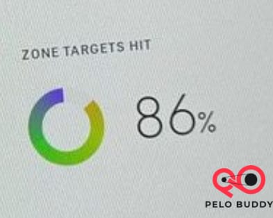
Lastly, you’ll notice a fresh “Zone Targets Hit” score, which represents the overall percentage of the ride during which you remained in the specified zone. It’s worth noting that, due to spin-ups being classified as a constant Zone 1, achieving a 100% score might be challenging, depending on your usual effort level during spin-ups.

We extend our gratitude to #Not2Innocent for sharing these images with us. Although these updates may not encompass all the features that people have traditionally relied on third-party tools for in the context of power zone rides, they hint at Peloton’s potential intention to integrate more of these functions into their platform. We’ll be vigilant in watching for any additional modifications.
It’s worth noting that this novel target power zone graph and data resemble another recent addition by Peloton. Last week, for the Peloton Row, a new pace target distribution score and graph were introduced, functioning in a manner akin to power zones.
If you haven’t experienced Peloton’s power zone training classes, the concept of “target power zones” may seem a bit perplexing. For a comprehensive understanding of Power Zone Training, you can access abundant information on Peloton’s website here. However, the fundamental idea to grasp is that instead of specifying a particular resistance, the instructor assigns an effort level ranging from 1 to 7. To determine your current fitness level, you take an assessment called an “FTP Test,” which lasts 20 minutes. Then, you align your individual output with the zone the instructor designates. Peloton simplified this process last year by introducing a target power zone indicator on the Bike.
If you’re a dedicated power zone rider, we’d love to hear your thoughts on this new graph and workout summary data. What’s your take on it?
Don’t forget to check our guide for the hottest Peloton instructors. Also, here are the best 125 Peloton Quotes for your Motivation.
Read also:
- Peloton Membership Cost Guide
- Peloton Guide Review
- Strive Score Peloton
- Cycling Movies: Best Biking Films
- Running Movies: Best Titles Ranked
- Peloton Bike Shoes: 16 Compatible Pairs
- Peloton Usernames Ideas Guide
- Peloton Girl Real Story
- Best Documentaries About Obesity
- Movies About Obesity Ranked
- 6 Week Plan Ozempic Weight Loss Results
- Progesterone Weight Loss Success Stories
- Ozempic Before and After Pictures
- 80 Day Peloton Before and After
- Mounjaro Weight Loss Before and After Pictures
- Motivational Weight Loss From Fat That Success Stories
- Power Zone Pack Peloton Guide
- Peloton Bike Generations
- Peloton Programs List
- Callie Gullickson Age
- Camila Ramon Peloton Trainer
- Charlotte Weidenbach Peloton Trainer
- Erik Jager Peloton Trainer
- Kirsten Ferguson Peloton Trainer
- Kirra Michel Peloton Trainer
- Mayla Wedekind Peloton Trainer
- Influencers Gone Wild Daring Content
- Mila Lazar Peloton Trainer
- Kendall Toole Husband Bio
- Hannah Corbin Husband Bio
- Olivia Amato Husband Bio
- Becs Gentry Husband Bio
- Jenn Sherman Weight Loss
- Rowing Shoes Matt
- Artist Reloaded July 2023
- Weekly Workout Plan Guide

Leave a Reply